This guide explains how to use the PhotonHub Europe logos correctly. See the Style Guide for proper use of the PhotonHub Europe logo.
If you have questions about the application of these logos or if you want different file types or the PhotonHub icons, please contact marketing@photonhub.eu
Presentation of the logo
There are two versions of the PhotonHub Europe logo: a vertical and horizontal logo. They both consists of two parts:
The brand icon
A lighthouse which is a symbol of a beacon.
PhotonHub has the ambition to establish a photonics innovation hub which integrates all of the best-in-class photonics technologies, facilities, expertise and experience.
The brand type
The typeface accompanying the icon.
The proportion between those two elements is captured and may not be modified.
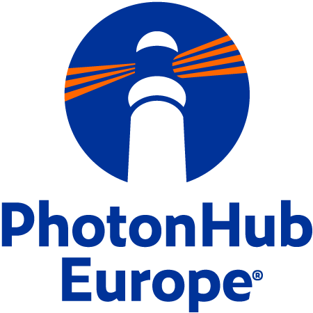

Vertical logo
The vertical logo is ideal for use in portrait formats. Whenever you have the opportunity to use the color version of the logo, one should. When the background is dark and legibility is at stake, a negative version of the logo can be used.
Horizontal logo
The horizontal logo is ideal for use in landscape formats. Whenever you have the opportunity
to use the color version of the logo, one should. When the background is dark and legibility is at stake, a negative version of the logo can be used.
Positive vs. negative
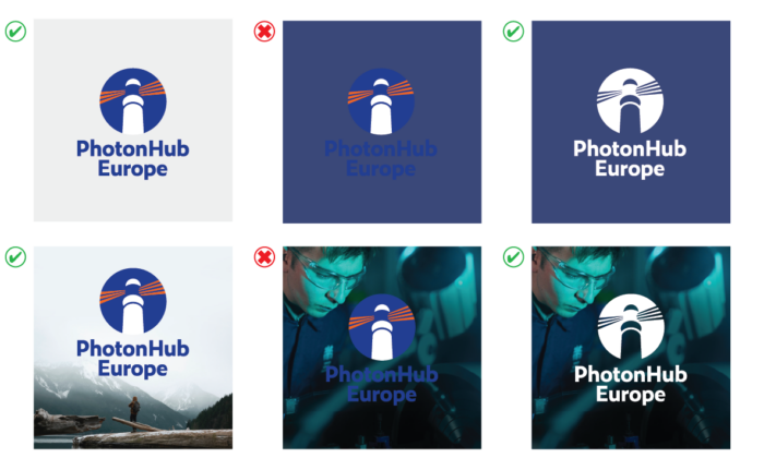
When to use the color or white logo?
The colored logo will be the first choice. This ensures the colors of the corporate identity are represented. The white logo can be used when visibility is at stake. That would be usually on solid color backgrounds as well as on photography. Be cautious about the readability when used on a photo.
Vertical vs. horizontal
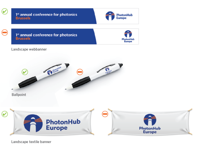
When to use the vertical or horizontal logo
The use of the horizontal version is preferred when the available space is limited in height.
Hereby a few examples where the use of the horizontal logo optimizes legibility. In these cases the horizontal logo fills up the available space better then the vertical logo. It’s more visible and easier to read.
When the height of the logo is ≤ 15mm the use of the horizontal logo is preferred.
The plain examples on this page are explaining the design principle rather then they are suggesting a visual guideline.
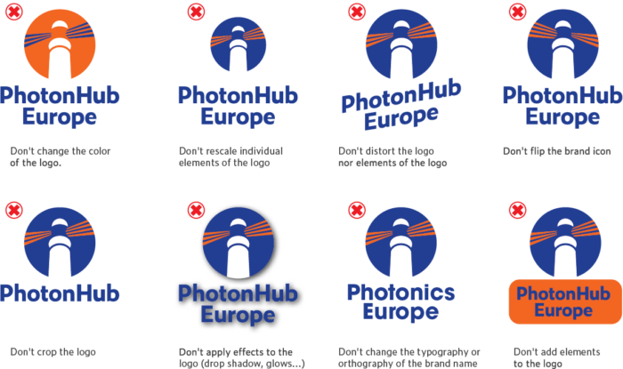
Don’ts
Minimum size
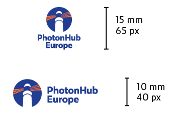
In order to ensure readability of the logo a minimum height should be respected.
The vertical logo must be at least 15 mm or 65 px. The horizontal logo must be at least 10 mm or 40 px.
Clearspace
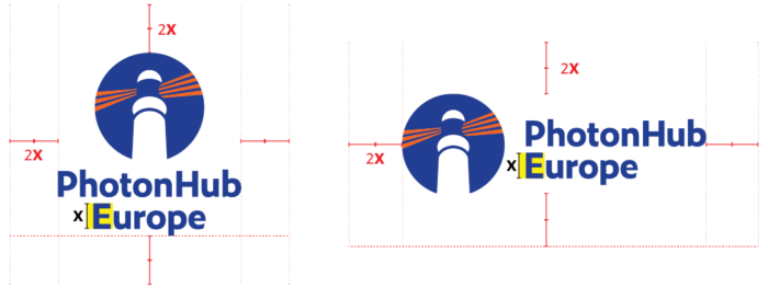
The clearspace is the protective area around the logo that should remain free of text, graphics, logos or other elements. The clearspace around the logo has the same size as the height of the capital letters in the logo.
